Left Coast T-Shirt Company - Artwork Guidelines
The artwork you send us makes a big difference in the way our graphic designer approaches your project. Even if you have nothing more than an idea in your head for us to start with, we can make you a design. But you can save us time and save yourself money by providing us with more completed art. Here are some tips and suggestions to help you expedite the design process. Again, these are not required, just guidelines to help it go smoother.
High Quality Images
We like to design from the highest quality files possible. This means that copying images from websites, printing your art, or enlarging small images will require us to basically recreate your art from scratch using what you’ve provided as a guideline. If you can provide us with original, high quality, digital files we can prepare your art for printing quickly, efficiently, and affordably.
Here are some tips:
- Original files are much more useful for us than printed copies
- Send us logos and artwork in vector format if possible
- Send us original files: one in the format it was designed in and one in PDF
- If using bitmap files, start with at least a resolution of 300 dpi (dots per inch) at actual print size
- Design with the medium in mind: try not to include bevels, drop shadows, or blurring
- If your design has overlapping pieces, send us the complete design as well as the separate layers
Saving Time and Money
Your first hour of design work is free, so you want to optimize that time. The less tedious work our designer has to do, the lower the chances that you’ll have to pay for design time in the end, and the easier it is for us to stay on top of our printing schedule. Things like finding fonts, re-typing lists, and cleaning up scanned or low-quality images take up a lot of time. If you can do any of this yourself then the designer can use your free hour of design to actually design for you.
Here are some tips:
- Specify sizes with the art you send us so that we know exactly how large you want it printed
- Specify reference points and distances from them for print locations. (i.e. 3” below the collar)
- Give us very detailed explanations of changes so that we can get them right the first time
- Send us font names or send the font files themselves along with the design
- Have your designer outline fonts in the vector file
- Let us know if there is anything you’re flexible about.
Raster vs. Vector
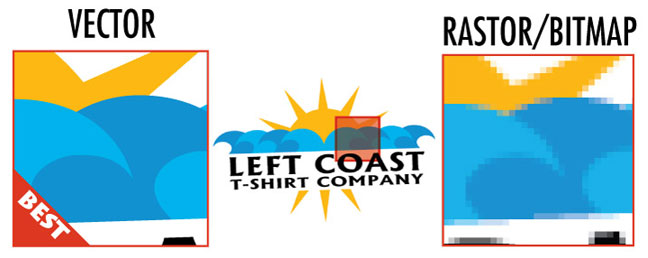
Raster (or bitmap) files use a square grid of colored pixels to create an image. Raster files are resolution dependent and do not usually scale in size very well. As the size of a raster file is increased or decreased the lines often become jagged and pixels become individually visible. Raster files work well for photos and or photo-realistic images but not very well for other types of art. Common programs that create raster art are: Adobe Photoshop, and MS Paint. Common file types and/or extensions of raster files are: psd, jpg, gif, png, and bmp.
Vector files use a mathematical equation involving angles, degrees, and coordinates to store a design. Since the information is stored this way, a computer can simply redraw the design at any size without losing any resolution. This means that vector images perfectly preserve your design even when it is enlarged to the size of a billboard or shrunk down to fit on business card. Most logos and illustrations are created in a vector format. Unless you’re design uses a photograph or includes a photo-realistic image it’s always better to use vector art. Most of the designs we print are made using vector art. Common vector art programs are: Adobe Illustrator and Core Draw. Common file types and/or extensions of vector files are: ai, eps, and cdr.
Here is an image that shows how a vector logo and a raster logo look after enlarged.

Spot Color vs. Halftones
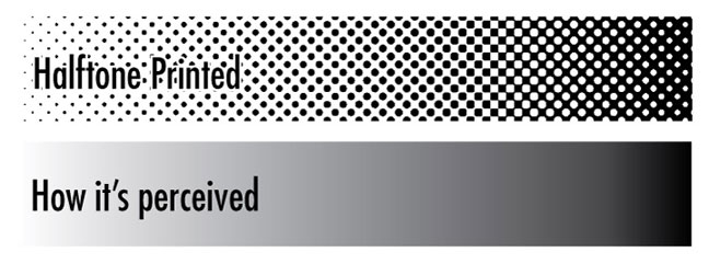
Halftone printing is the use of small dots to simulate a tone of color. When printing a halftone different size dots are printed at varying distances apart to create an illusion of a lighter or darker tone than the color that is actually being printed. From far enough away, the human eye perceives an array of dots as a smooth, mixed color. In screenprinting, the use of halftones is very common because the number of colors that can be used is limited.
Halftones work well for gradients, and/or blends of color, or in some circumstances, for very small areas of color that aren’t worth the extra cost of including in a finished design.
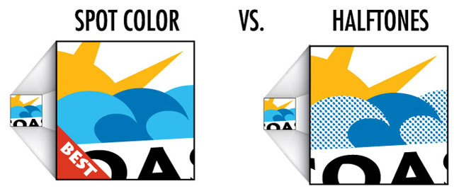
Halftones do not work well for solid areas of color that are prominent in a design. Sometimes customers want to use a halftone to save on the cost of extra colors. They can get carried away with this because it doesn’t usually work well. If the color that is being eliminated is not large and also not significant to the overall design this can work okay. On the contrary though, if the color being eliminated covers a large area, or is a critical component of the design it is almost always better to use a regular color to print it correctly.
In general, a good best-practice rule-of-thumb is to use halftones for what they were meant for; gradients, and blending. Anything else should be questionable.
Below is an image showing the much better use of a regular color instead of the cost saving halftone.

Below is an image showing how a half tone is printed and how it is perceived by the human eye. The gradient shown represents a good example of how a halftone should be used; ie. for gradients and blending.

Common Mishaps
- Providing us with website logos; they look good on a screen but not when printed
- Creating the design on a computer but bringing it to us on paper; please bring us original electronic files
- Enlarging a bitmap file; blowing up low-resolution files give us jagged lines and visible pixels
Heather Hayes
Administrative Coordinator, Family Care Network, Inc., San Luis Obispo CA

